


In 2020, the Cruidoce considered that was needed a market repositioning that met its essence and its goals. For that, this project was delivered to Famazing, a marketing and communication agency. It dedicates to the whole rebranding process, from the creation to the identity, till the communication channel refresh. All the process has begun with the logotype. It was key that it conveys the tradition and the inspiration that the brand symbolizes. After many meetings and studies, the logotype was born.
![]()
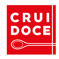
Looking at the logotype in detail, it is findable easy-reading lettering, as well as a wooden spoon which intends to represent all our products’ tradition. Being equally important, the slogan is present on the upper part, and the Frisalgados group on the lower part, reinforcing its intrinsic values. Concerning the frame, it allows that the logotype has the deserved highlight. Each detail of this rebranding process was outlined to communicate in a more direct and closer way with the consumer, valuing the tradition, the quality, and the inspiration.
